Review FAQ: Disclosures, Policies, The Glossover, Photos/Swatches
DISCLOSURES
Any pertinent disclosures will be included at the top of each post. We currently mark posts at the top with the labels “Affiliate Link,” “Purchased,” “Sample,” and “Sponsored.” In the case of paid placement, the post title will begin with “Sponsored” for absolute clarity. Below, you will find more in-depth descriptions of the common disclosures we make on the blog:
- AFFILIATE LINK | The majority of links to third-party retail websites are affiliate links. We receive a commission if you purchase any product(s) through affiliate links. It does not add any cost to you as the customer. The commission comes out of the retailer’s pocket, and the commission can range from as little as 1% to as much as 15% depending on the retailer, campaign, product type, etc. For many of our affiliates, if a product is returned, the commission is returned as well.
- PURCHASED | The products featured on the blog is a healthy mix of products purchased by us for review as well as samples provided by brands. In order to make it clear that disclosures were not omitted or forgotten, we began including Purchased to indicate products we bought ourselves.
- SAMPLE | Brands, their representatives (such as their public relations firms, marketing affiliates, and the like), and retailers will send a product for consideration. Consideration means that the product is submitted to us so we can check it out and determine whether it is a product we want to include on the blog. We make all decisions regarding when, how, and if it is even mentioned on the blog. We do not allow brands to read a review in advance. We do not accept compensation for our product reviews.
- SPONSORED | Sponsored posts are specific posts that we have been compensated for. “Sponsored” will occur in the title of the blog post. Sponsored giveaways, where the compensation may be in the form of prizes and/or financial compensation for exposure, handling of fulfillment, etc. We do not endorse or otherwise review products for compensation, so you will see topical content (e.g. “5 Tips for a Girl’s Night Out”), giveaways, promotions (like an upcoming sale), or advertorials (advertiser/brand-written content). You may find round-ups or gift guides of a variety of products that are sponsored, but these will only contain products we’ve reviewed previously (that were unrelated/unattached to the paid post) and brands cannot have any stipulations on specific products/brands for inclusion (e.g. they can direct the theme, like products under $15, but they can’t say “it must include this brand”). We also develop larger experiences like brand-driven Foundation Matrix matching, which involves creating and developing code and design for the brand, or swatching all shades in a foundation formula. There can be NO requirement that we must review products that are related to sponsored posts (unless a review existed prior to the brand reaching out).
Collaborations
We have previously collaborated on a single eyeshadow, Jealousy Wakes, MAC Cosmetics in 2011. There was no monetary compensation provided; travel and travel-related expenses to visit the lab and initially create the eyeshadow were paid for.
Currently, Temptalia is collaborating with Sydney Grace to create and release three eyeshadow palettes to be released spring 2021; this project began in early 2020 (wish list of colors sent at the end of January, first color samples arrived in late March). When these palettes are available for sale, Temptalia will earn commission on the selling price of each of the palettes created (but not any of the brand’s other products). Temptalia is under no obligation to review or feature any Sydney Grace products except to promote the three palettes we are creating with the brand.
Temptalia reached out to Sydney Grace in late 2019 with the pitch for a collaboration, and we started to work out preliminary details in January 2020 with the first round of color samples was made and received in late March 2020. The second round of color samples was received in May 2020. The third round of color samples was received in October 2020, which is when some colors were finalized and approved to move into production; shade names and placements were also finalized in October 2020 — this marking the move from concept to materials (like ingredients, pigments, etc.) and packaging being ordered.
POLICIES
- Personal Experience: All reviews are written based on the Author’s personal experience with the product and is not influenced by third parties (advertisers, brand representatives, public relation representatives, etc.). Products are tested in the way(s) and for as long as necessary to properly test a product–e.g. a lipstick requires less time to test than a moisturizer.
- Based on Claims: Each product is tested and reviewed based on the claims the product makes. As much as possible, we defer to marketing/advertising text as written by the brand. Whenever we feel we have to make interpretations, we try to walk readers through that interpretation. We typically err on the side of the customer rather than give the brand the benefit of the doubt.
- Fairness: We review products in full and do not hide or ignore areas that could be improved. When you see a review that doesn’t mention any cons, that means we couldn’t find any. Similarly, if you see a review that’s all negative, it’s not because we want to bash a product–it’s because the positives weren’t there!
- No Brand Oversight: We do not make changes to the character of our reviews. We have not personally had a brand ever reach out in an attempt to change what we have written, but should it ever occur, we would not make those changes. The only changes we will make to a review or post is for things like pricing inaccuracy or adjustments, retailer availability, release date updates–fact-based changes that have no impact on our opinion but facilitate the spread of pertinent information.
- Rating System: We use our own rating system, known as The Glossover, to help guide readers through our reviews and understand the components that make up the overall rating. Please see below for an in-depth explanation of The Glossover.
THE GLOSSOVER | A RATING SYSTEM
Our rating system looks at specific areas, and these areas depend on the type of product. Each area is given a score, and all five scores are added up, and the total is divided by the total possible points (45) to yield a percentage. This percentage is converted to the American grading system. Presently, there are two rubrics in place, one for color cosmetics and another for tools.
What do the letter grades mean? An A is an outstanding/excellent product; a B is a good product, but there may be better ones out there; a C is an average product that isn’t good but not awful; a D is a below average product; and a F is a product that fails to meet stated claims. It is imperative to read both the review and rating to get an accurate assessment as to where the product excelled or failed.
- 99-100% = A+
- 93-98 = A
- 90-92 = A-
- 87-89 = B+
- 83-86 = B
- 80-82 = B-
- 77-79 = C+
- 73-76 = C
- 70-72 = C-
- 67-69 = D+
- 63-66 = D
- 60-62 = D-
- 59 or below = F
Please note that the rating system has undergone changes throughout the life of the blog. This is an explanation of the current system (labeled The Glossover) utilized on the blog, so there may be differences to the rating systems employed previously. As of October 2012, we have removed packaging as a component of the rating system. As of August 2016, we have added a second rubric for tools.
Color Cosmetics | An Overview of the Rating Rubric
Naturally, because of the nature of cosmetic products, one characteristic may impact multiple areas. For instance, a very creamy lipstick may also be prone to bleeding color or the creamy texture may enable it to glide on more easily, while a dry lipstick may be harder to apply and drag on lips, it may wear longer.
Product | This area looks at how well the product lived up to the claims the brand made (should they fall outside of the other four areas, such as hydration or plumping) and overall quality. (10 points possible)
Pigmentation | We assess whether the color payoff is as described (by the brand) and color trueness. Please take note, we first look at the brand’s/retailer’s website (that sells the product) to determine the level of pigmentation the product is supposed to have. A product that is supposed to be sheer and is sheer will receive full marks, whereas a product that is supposed to be sheer but is totally opaque would lose points. (10 points possible)
Texture | This area is concerned with assessing how a product feels and includes, but is not limited to, characteristics such as dryness, softness, creaminess, evenness, weight, powderiness, smoothness, streakiness, and so forth. (10 points possible)
Longevity | This area assigns a rating based on how long and well a product wears relative to how long it is supposed to wear. When a brand does not indicate a specific wear time (often the case), we interpret based on industry standards (e.g. “long-wear” doesn’t mean one hour if you look across the industry) or see how it falls against the average wear time of similar products. Longevity is not purely based on time but how it wears and considers such problems as chipping, creasing, fading, feathering, settling, and smudging. For your reference, here are some average wear times based on the Author’s experiences over ten years (10 points possible):
- Blush: 7-8 hours with very minor fading
- Eyeshadow: 7-8 hours with very minor fading but no creasing (without a base), 10-12 hours with no creasing/fading (with a base)
- Eyeliner: 8 hours with very minor fading but no smudging
- Foundation/Concealer: 6-8 hours with minor fading around t-zone, possible light creasing along laugh lines or underneath the eye
- Highlighter: 6-8 hours with very minor fading
- Lipgloss: 2-3 hours for extremely sheer color; 3-4 hours for all others
- Lipstick: 3-4 hours for extremely sheer color; 4 hours across all; reds and colors prone to staining tend to last 5-6 hours
- Nail Lacquer: 8-10 days with minor tip wear (with a base/top coat), 7 days with minor tip wear (without a base/top coat)
Application | This area focuses on how easy it is to apply a product, whether it requires instructions, how difficult is it to remove it, does it bleed/feather, how evenly does it apply, and the like. (5 points possible)
We have specifically considered (at great length) and removed the following metrics over time: price/value and packaging.
A Note on Primer
People often ask me why I test things without primer, and the reason is that after reviewing products for awhile, I really started reading how brands were marketing/describing their products. I repeatedly saw eyeshadows being described as richly pigmented, long-wearing, crease-resistant, fade-resistant, blendable, etc. Some brands have eyeshadow but not an eye primer (less common now, I think). In an effort to hold brands to what they claim (even when it seems ridiculous), I started testing without primer. It is entirely possible to put out a formula that is intensely pigmented, blendable, and easy to use without primer–and for me, longevity is there, too, which is an aspect that can be your-mileage-may-vary (I have normal-to-dry lids, for example). [Note: in the same vein, lip products are not tested with lip balm, lip primer, or lip liner; cheek and face products are not tested for longevity with primer or set with powder; foundation is often tested for several days, if not weeks, and various ways.]
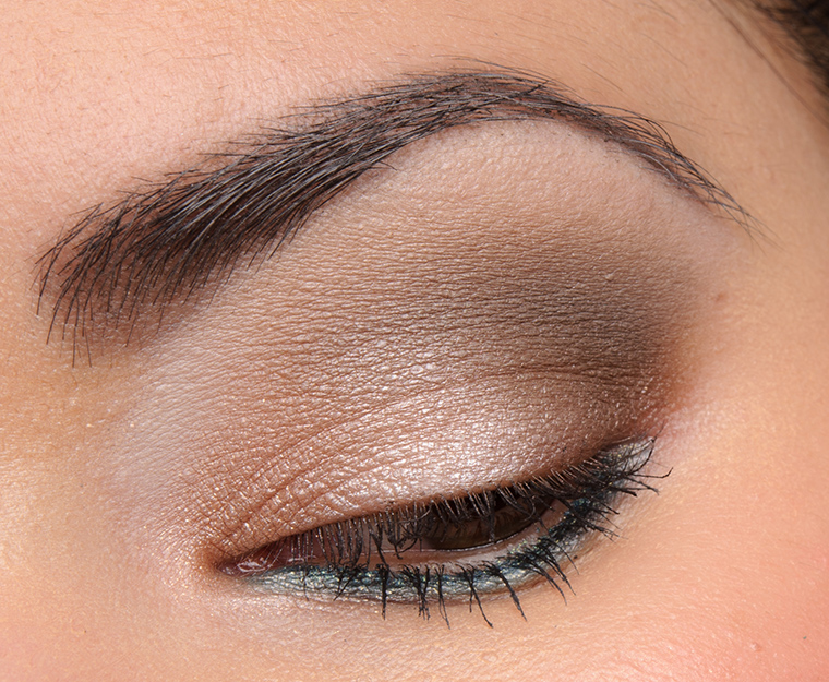
I wore the same eyeshadows over bare skin and over primer (MAC Prep + Prime 24 Hour Base) — I couldn’t tell the difference between the two until after 10 hours of wear, and I couldn’t tell while applying, either. For me, the key takeaway is that primer extended the wear, but the eyeshadow itself was effortless to apply and use, no tricks necessary–it was still a quality product on its own. Viseart isn’t the only one formula that works well alone or paired with a base/primer, but it was just something on my mind recently. Since Viseart had tested so well in the past, I thought they’d be a good example to show what good eyeshadow is capable of. 🙂 (And if you’re new, unless in the caption, any look/swatch is posted without using primer.) That being said, I love that eye primer exists, and I totally understand why it’s a staple in many people’s routines–it’s a worthwhile product to have in one’s stash for the extra insurance/peace of mind for impeccable wear as long as you need it. I figure if primer is part of your routine, it is easy enough to add a 1/3 to full grade up depending on where products missed 🙂
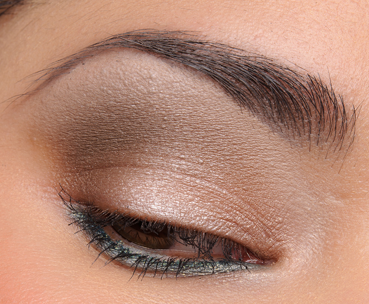
Viseart Cashmere Theory Palette
Viseart Cashmere Theory Palette (over MAC Prep + Prime 24 Hour Base)
Tools | An Overview of the Rating Rubric
Developing a core set of metrics that apply to a variety of products was particularly easy with respect to color cosmetics, but other types of products are harder to rate in large groupings beyond something like efficacy or overall quality. When creating a rubric that could be applied to a variety of tools, we looked at more objective ways to assess a tool’s quality at a glance.
Product | This is a rating assessed on the overall quality of the tool along with any claims that may not be accounted for in the other metrics.
Fitness | We look at whether the tool performs the way it is designed based on what the brand claims, and if the absence of claims, we will do our best to determine the type of tool and what the tool is typically expected to do. For instance, a brush that is supposed to be used for liquid foundations would be rated based on its performance with different types of liquid foundations and application methods but would not be rated based on usage with powder foundations, even if its use might be tested with it to provide more information to the reader.
Durability | This metric is a measure of how well a brush has held up to multiple cleanings, is it relatively easy to clean, does it dry quickly, does it smell after a wash, does bleed dye when being washed, how well does it retain its shape naturally, does it shed over time, and so forth. While we would love to test brushes for years and report back, that’s not feasible, so durability is usually assessed over a month or longer or based on accelerated tests (washing every day).
Construction | This is a determination of the quality of the tool with respect to things like the overall shape, cut, and build of the tool. As the majority of tools reviewed with this system are brushes, here are specifics to brushes that we look for: quality of ferrule, closeness of the ferrule to bristles, any loosening of the ferrule, scratches or marks on the handle or ferrule, shape of the brush head (are there stray hairs poking out? are they glued in or just leftover from initial creation?), quality of the fibers used, weight distribution over the handle to the brush head, and so forth.
TEMPTALIA RECOMMENDS
This feature was added October 2012, so it will not be seen in earlier reviews. It is a designation awarded by the Author to particularly worthwhile products and the recommendation is subjective. The recommendation is not awarded purely because of a grade, as there are many highly rated products that will not have this designation. Whether a product is or is not listed specifically as “Temptalia Recommends” has no impact on the overall rating.
The best way to explain why a product is recommended is that it is an overall look at how well a product performs, how interesting/unique it is, where it falls against competitors, if it is of particularly good value, and the like. It’s the difference between a product you know is good and a product you love and want everyone else to love and have and adore. It’s the answer to, “But would you buy it? Would you recommend it? Do you think it’s worth it?” It’s for products that stir us, move us, and truly impress us.
PHOTOS/SWATCHES
Photography
We do our best to take clear, well-lit photos that depict color and texture accurately. Unfortunately, brightness, contrast, and color can vary wildly from device to device, screeen to screen. Even just angling a laptop screen forward or backward can greatly change the contrast and intensity of color! Here are the steps we have taken to try to minimize variance to the best of our abilities:
- Studio lights: these offer consistent lighting whether it is cloudy or sunny
- Consistent settings: we use the same settings when shooting to avoid variance, and these settings are calibrated every other month or so to ensure they are appropriate (they do not change much, unless equipment changes, e.g. a camera upgrade)
- Color average across multiple devices: we use default screen/color settings and try to get a good “average” across these devices – iPhone 7+, iPhone 7, MacBook Pro, LG PC Monitor, iPad. The goal is to try to find a good color profile that looks fairly accurate on multiple devices vs. accurate on one device but wildly inaccurate on other devices. We will favor iPhone/Apple monitors over PC (though all editing and work are done through PC) due to the percentage of our users who use iPhone/Apple devices to view the site.
- Color balanced editing room: all lights are color balanced and take ambient light into account so help maintain consistent editing settings, including the time of day that phones are edited and reference photos are made
Editing
All photos, whether for products or swatches, are edited for accuracy but not to make products look better (or worse) than they are. We may adjust color, brightness, contrast, etc. as needed to depict the most accurate color by looking at the product in person while editing. Backgrounds may be brightened or touched-up (e.g. a speck of dust, piece of lint, and so forth will be removed). When it comes to skin retouching, something like removing a pimple from a series of lip swatches may be done (we all have pimples but photos live forever), but if the photos in question were with respect to a concealer, foundation, pore smoothing primer, etc. all “flaws” would be left as is so that the photos would accurately depict things like coverage, ability to hide texture, and so forth. Similarly, lip swatches are not edited to make a lipstick look like it applied better by sharpening the edges or blurring imperfections on the lips–if the lipstick catches on flakes, we want you to see that.
Swatches
Currently, swatches are applied by taking flat, firm synthetic brushes and pressing, gently pulling the product about 1 centimeter at a time, and then repeating for the length of the swatch (about 3-4 centimeters). After the color is applied for a swatch, we take a clean fingertip and use that to blend and soften the edges of a swatch using a technique/pressure that is similar to using a fluffy brush (so really skimming gently across the surface). Primer is not used in swatches unless specifically notated in the swatch’s caption.
The methodology we settled on for swatches was decided after trying over thirty different types of products applied in practice (e.g. eyeshadow onto the eyelid) against the swatch. The goal was to make these similar so that swatches would be accurate in terms of color payoff (as finger swatches can sometimes apply products more heavily).
Note, if a brand specifically says to apply their product a certain way, e.g. “with fingertip for maximum coverage” or “wet for full coverage” then that is the method used (I try to follow instructions first, then deviate as necessary to see how things work using other techniques).
There are some products that may show more than one swatch for the product, and here are those instances explained:
- Lip Swatches: Lip products typically have two photos depicting the lips. One is in direct light, which we use to simulate sunlight; think of it was the best and clearest light, where flaws are hard to hide. The other is indirect and diffused light, which we use to simulate shade; think of this as more forgiving light, an office or a room where some light filters in but it is not bright. Direct light offers better insight into texture, finish, and undertones, whereas indirect light is more accurate for inferring true vibrancy (direct light makes all products appear a little brighter and richer) and is worst at showing finish (sparkles, shimmer, and glossiness get lost).
- Dry/Wet Formulas: Products that can be used dry or wet are often shown both ways, usually with the first swatch being dry and the second swatch (immediately next to it, within the same photo) is the product applied damp (unless otherwise specified).
- Sparkle/Glitter Formulas: Products are applied as-is as well as wet, usually with the first swatch being dry and the second swatch (immediately next to it, within the same photo) is the product applied damp (unless otherwise specified).
- Cream Formulas: Most cream formulas are shown as a regular swatch, and then deliberately blended and sheered out — e.g. cream eyeshadows are shown “as-is” as well as a sheer wash of color, cream blushes are shown “as-is” and then sheered out as a wash of color (using an “average” amount of product – not using the teeniest, tiniest bit but not loading up the area either!) as many people wear their cheek colors at sheerer coverage levels than opaque.
- Cheek Products: The majority of cheek products showcase two swatches within the same photo. The first swatch is “as-is,” swatched like any other product, which will give insight into the true color, intensity, undertone, and its coverage level. The second swatch is blended and diffused to mimic application as it would appear on the cheeks, and this gives insight into the blendability of the powder as well as the real finish (products can often have better or worse finishes as they are worked onto the skin).
- Liners & Pencils: Eyeliners/eye pencils and lip liners/lip pencils are often narrower at the tip than a lipstick, so the first swatch is a single pass of the liner or pencil, and then second swatch is a larger swatch to give better insight into the actual color, undertone, texture, and finish of the product as even in a macro photo, the single pass is too narrow to accurately depict color. Though we do not try to build-up or layer the product heavily in the larger swatch, there is overlap as we go back and forth to create the larger swatch and make it look continuous, so the second swatch should not be used to accurately assess pigmentation.
- Loose Pigments or Glitters: Loose pigment is often shown as a dry/wet combination, as they typically are such a formula. Loose glitter is often shown as loose/dry and then over a glitter adhesive.