How I Understand Colors & Undertones in Makeup (Part 1)
Describing colors and undertones is a challenge. It’s something that I’ve been working on for almost 15 years, especially because no matter how well I might calibrate my colors on my end… I can’t control how they’re viewed on a plethora of devices, screens, and lighting conditions. (Seriously, just tilt your screen slightly and see how colors adjust; then what happens if you turn your brightness down or, if you have an iPhone like me, turning on and off “true tone” — this is why I actually try to get a “happy medium” between multiple screens/devices I have.)
It has helped me to think of each color as a spectrum that ranges from light to dark, cooler to warmer, which means that even though a color might be a warm color, there are “cooler” versions and “warmer” versions as well as “balanced” versions. It’s also useful to know that there are multiple ways to describe colors sometimes, so you might say “that’s a deep peach” and someone else might say “that’s a muted coral.” Go google “coral” or “peach” or any non-primary color and see the gamut these colors run. You might try typing in random colors into Pantone’s Color Finder (which is a system used by a lot of industries).
I think of warmth and coolness as relative rather than absolute in most instances; red is a warmer color per color theory, but there are cooler-toned reds and warmer-toned reds along with reds in the middle (often referred to as true or neutral). This is true across primary, secondary, and tertiary colors… and all of the in-between colors we’ve come to use.
There are a lot of external resources if you want to understand color theory, but here’s a summary: the color wheel starts with three primary colors: red, yellow, and blue. When you mix two of these shades together, you create three secondary colors: orange (red and yellow), green (yellow and blue), and purple (blue and red). Then there are six tertiary colors, which are created when you mix primary and secondary colors together (like yellow-green or blue-purple). The color wheel defines warm colors as reds, oranges, and yellows with cooler colors as blues, greens, and purples.
Colors that are opposite of each other on the color wheel are considered “complementary” (like orange and blue), whereas colors that are beside each other (yellow, green, blue) are considered analogous. With respect to makeup, colors that are analogous are usually easier to blend together, where as complementary colors can muddy more readily.
Burgundy | Cooler
Burgundy is a deep red, and when they’re cooler-toned, they tend to look almost purplish with a lot of depth and darkness (and are less vivid/bright) compared to true red hues.
Burgundy | Balanced
Neutral burgundies are somewhere in-between; I find neutral to be a narrower spectrum in this color category compared to others. They often only look neutral when put against very cool or very warm-toned burgundies.
Burgundy | Warmer
Warmer-toned burgundies have less purple, more red or brown to them. When these tones appear in lighter shades, they can be better described as plum.
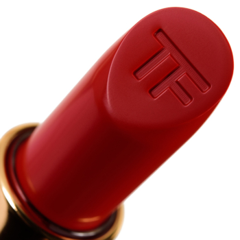
Red | Cooler
Cooler-toned reds have strong, blue-based undertones, and when they get very, very blue-based, they look more like pink-reds (and sometimes could be classified as magenta, when they’re brighter, or berry or raspberry if they are deeper).
Red | Balanced
Neutral reds are ones that have a balance of blue and orange undertones; to my eye, they can lean one way or the other depending on one’s coloring or whatever it is paired with. It is always easiest to determine when you put a neutral red against a very cool or very warm-toned red, though. You can also sheer it out and see how the base blends out, which is another helpful way to see undertone (in general).
Red | Warmer
Warmer-toned reds have stronger, orange undertones; deeper, warm-toned reds can look almost brown.
Fuchsia | Cooler
Fuchsia is best thought of a vivid take on pink, whether it’s a brighter, lighter pink–think bubblegum or cotton candy but make it neon–or more mid-tone (which I’d say is closer to true fuchsia), which is a vibrant, medium-dark pink with stronger, cooler, bluer undertones. The deep fuchsia gets, the more it starts to look like other shades; cooler, deeper fuchsia shades could also be lighter, cool-toned berries.
Fuchsia | Balanced
“Balanced” fuchsias tend to appear like richer, more vivid true pinks than really purple or blue-based.
Fuchsia | Warmer
Neutral-to-warmer-toned fuchsias look like pink-reds and blue-based reds (and may be more aptly described as magenta, which is redder compared to true fuchsia, which is purpler).
Pink | Cooler
Cooler-toned pinks have blue-based undertones, and they are often described as “cotton candy” or “bubblegum” (but they will be lighter and/or more muted, less neon, compared to lighter, cooler-toned fuchsias!).
Pink | Balanced
Neutral pinks are, you guessed it, more balanced between blue and yellow undertones, though I find that within the industry, neutral pinks tend to really mean more muted pinks and can lean warmer more so than true neutral.
Pink | Warmer
Warmer-toned pinks have yellower-based undertones, and sometimes, they get into a peachy/coral range. Lighter, very warm pinks can be described as pinky peaches or true peach, while deeper, very warm pinks can fall into pink-coral or true coral territory.
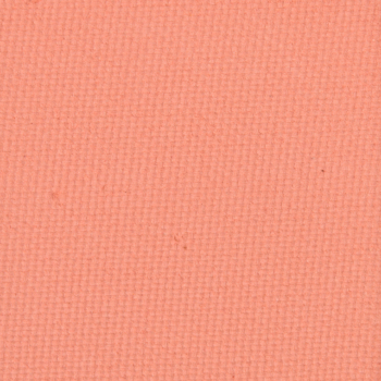
Coral | Cooler
Coral is either a pinkish or reddish variation on orange, and in cosmetics, there are pink-leaning corals (which are “cooler” on the spectrum of coral) and orange-leaning corals (which are “warmer” on the spectrum of coral). The pinker a coral shade leans, the closer it is to a very warm-toned pink.
Neutral is when there’s a balance between pink and orange undertones, and these are often referred to as “true corals.” They’re less likely to be described as “neutral,” since coral is really a warm-toned shade — so it’s more like a “cooler” vs. “cool-toned” when you’re describing how pink or orange a coral hue leans.
Coral | Warmer
Warmer-toned corals tend to look more orange with just a hint of pink or red, and they are often more vivid/brighter compared to peach as a color. The more orange a coral shade leans, the closer it leans to a cooler-toned (red-based) orange.
Copper | Cooler
Copper is often thought of as a “reddish-brown,” but in the makeup industry, it runs from a richer, deeper gold to rose gold to brighter, warm red-orange. Cooler coppers lean redder or rosier; they’re closer to rose gold or warmer reds rather than dominated by orange or gold/yellow.
Copper | Balanced
Like other warm-toned shades, “neutral” is relative–it’s more of a copper balanced between red and yellower undertones; I classify more orange-leaning coppers here.
Copper | Warmer
When coppers start moving from orange to more golden, they seem like they get brighter as well as warmer. They’re further away from red undertones, which are “cooler,” so this is how I’ve come to identify more golden coppers as warmer.
Orange | Cooler
“Cooler” oranges have strong red undertones, so they may even look more like an orange-leaning red to your eye. They will look less true orange–like construction cone orange–and will not lean yellowy either.
With respect to orange, “neutral” is more like a true orange, one that is balanced between red and yellow undertones.
Orange | Warmer
Warmer oranges have yellower undertones that pull the color away from red-orange and given it a more golden hue, which can sometimes mute the brightness of orange as well.
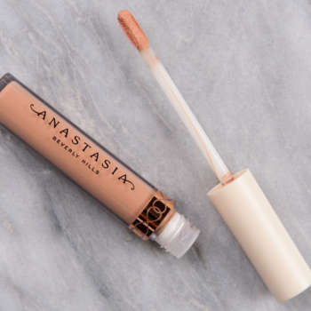
Peach | Cooler
If you think about peach as a fruit, it just makes you wonder if we’re referring to the flesh of the fruit or the skin of the fruit? The skin is quite varied depending on the peach variety, whereas the flesh definitely tends to be yellower more often. Between more typical understanding of “peach” by readers as well as how it’s used in the industry, I’ve come to understand peach as more of a washed out, lighter concept of coral, which means that “cooler” peach shades are pinker.
Peach | Balanced
This results in more “neutral” peaches to be the “true peach,” which are more balanced between pink, orange, and yellow.
Peach | Warmer
Warmer-toned peaches go between orange and yellow–lighter peaches seem to get more noticeably yellow, whereas very warm-toned, darker peach hues tend to get more orange-leaning. They can sometimes be thought of as very, very light oranges or the space where yellow and orange meet.
Gold | Cooler
When we speak of “cool” golds, it’s about looking at it on a spectrum of cooler and warmer gold hues, so these are cooler but may still be classified as a warm color overall. I’ve found that when gold gets closer to truly cool, they end up looking more like a lighter, brighter taupe (sometimes described as platinum), which I’ve classified as “pewter” (will be described in part two!). These types of golds tend to look almost greenish or more champagne, white-based.
Gold | Balanced
Because gold is a warmer color, there’s no true “neutral” undertone so much as a balance between what can make a gold cooler or warmer; it is the space where “true gold” lies–where the yellow undertone is most prominent, so it doesn’t appear greenish nor does it appear more orange.
Gold | Warmer
Warmer-toned have stronger, more orange undertones coming through. Lighter, very warm-toned golds may appear “peachy,” where as darker, very warm-told golds may look “copper.”
Yellow | Cooler
Cooler yellow are ones that have a hint of green, they also run lighter rather than deeper on the light-to-dark spectrum. If you’re familiar with the typical “highlighter yellow” markers, that’s the vibe. I have found that cooler yellows still pull yellow enough that they don’t get into “chartreuse” territory (yellow-green), but to some, that might be a closer descriptor of a “cooler” yellow.
Yellow | Balanced
A balanced (rather than “neutral”) yellow is a true yellow, so it doesn’t pull green and doesn’t have orange or red undertones mixed in.
Yellow | Warmer
Warmer yellows are ones that approach very light orange, so they will have brighter, more vivid tones and see a mix of yellow and orange undertones.
Beige | Cooler
Cooler beiges range from having an almost grayish cast to a muted, pink tone to it. I think the key to understanding beige is thinking of it as a very, very light brown, like 20% brown and 80% white. Otherwise, it tends to be more useful to think of as pink, peach, or brown.
Beige | Balanced
More balanced beige shades tend to look less gray and have pinker, rosier tones to them. They always put me in the mindset of a more muted, washed out pink or pink-peach.
Beige | Warmer
Warmer beige tends to lean slightly peach or yellow-orange–true yellow may be more of a balanced beige than particularly warm, as when beige itself is a lighter color, it often has a muted quality when there is a yellow tone to it. “Warmer” beige is a color I don’t find exists as often as “cooler peach” does.
Head on over to part two, which will cover green, teal, aqua, blue, berry, plum, purple, lavender, brown, taupe, mauve, pewter, white, silver, gray, and black.


Very well put together index and explanations for those who perhaps do not have an art background of some sort. Thankfully, I do….but sometimes it makes me feel like an idiot when I’m trying to explain to an SA that a shade is a “cool yellow”, “warm-toned blue” or a “colder pink (or purple)” and they look at me as if I have three heads! I’m dead serious, not everyone gets it even after I try to explain it to them. Here’s hoping that many more ccosmetics SA’s will see and read this series of articles that you’re writing.
It can be really hard to learn the language of color! I still feel like I have to train my brain to think of certain relationships as warmer/cooler!
This is going to be so helpful going forward when we can get back to the stores but maybe not be able to swatch.
Grand. This clearly took a lot of thinking and organizational work. It does help.
Thank you for this!
Love this series, Christine!
This is amazing! Thank you for taking the time to write this.
Wow this is very informative and helpful!!! I’ll definitely save it and read it again and again in the future! So fascinated by colors in makeup. I think I first knew from “cool-toned red makes your teeth look whiter” quote. As I went on purchasing and experiencing more in makeup, I’ve come to realize what color works and WHY it works on me. The process of finding out is interesting enough for me.
This is fantastic! There is no industry standard and there are subsets of people on certain bandwagons who disparage others as not knowing colour. This is an easily accessible primer with excellent comparative swatches.
It doesn’t help that a lot of colors are like peach… the inside of peach? the skin? what variety of peach? Same for rose… do you know how many types of roses there are?! They come in tons of different colors!
Christine, it’s obvious that you’ve put a lot of thought and time into this series of teaching articles and I’m really appreciative. I’ve never known much about color theory in the past. I know what colors I like and which I believe look good on my complexion. Now I’m learning why that’s so. Would you consider creating a “folder” to house all of your recent articles to make referencing quicker? Thank you for all that you do to enlighten us.
They are under this category: https://www.temptalia.com/category/features/makeup-tips/
(listed at the end of the post!)
Once again Christine, you have provided an indepth information that provides an analysis of the colour wheel and how it can inform our choices in makeup. I really appreciate the clear examples you have chosen re lipsticks, blushes and eyeshadows to show us what the differing undertones can look like.
I find that I am a bit of a hybrid – I use the cool toned foundations and blushes – coral tones. I realise that using the moniker of peachy/coral isn’t really accurate as the peach aspect can make the blush too yellowy/orange for me.
However I am drawn to warm toned eyeshadows and lipsticks.
This article helps us to re-examine our stashes and helps to guide us as to why we don’t use certain products we have. Much like clothes – I think all of us have a top or a dress that we don’t wear because of the colour and we don’t know why.
I like your point on clothes and color theory. I also always noticed that some eyeshadows and tops simply make me look sick and tired, and I avoided them. Color theory helps a lot in some sense. I’m warm toned, with yellow undertones, but I burn easily like a cool fair complexion (aka I don’t have olive in my undertones); yellow and red based eyeshadows simply don’t look good on me; I always get compliments when I wear a cool toned red or blue top; but I look good in a warm cream or brown; when I see myself in a white or slightly yellow green I just want to go and change my clothes. 😆
I think I’ve left all my comments on part 2. This has been a fabulous series. I am also further confused as to why I love some colors and hate others for makeup purposes. It is unrelated to cool vs warm or true.
Interesting.
This is an amazing guide! Thanks for putting it together! It is so satisfying to look at this rainbow of swatches. -]
This is gold! Thank you so much Christine, now to go read Part 2.
Very useful post! Excellent (titanic) work! There’s a way to save this post in a sort o favourite-post-list to find it easily each time? I’ve tried to navigate through the menu voice, but I haven’t found the way yet?
You can bookmark the page to your favorites on your device, but there isn’t a way to save the post to your profile!
Thank you for the suggestion!
Regarding how colors and undertones look on different screens, I always check swatches on my home laptop, on my work laptop and on my phone… and still things surprise me in store. 😆 That’s why sometimes reviews and multiple people describing the color helps. Because further the screen settings, colors look differently on different skin tones. I’m lucky enough to be one shade lighter than Christine, and I have learned what to expect in terms of colors and undertones from her swatches. ?
This is an extremely helpful guide for me! I’m going to refer to this post frequently. Thanks so much Christine!
Great for me on the lipstick as I have the hardest of times coordinating with my eyes. Sometimes now I do the lipstick first then the eyes just to get it right.