How to Build Your Own Eyeshadow Palette
Building your own eyeshadow palette is easiest when you understand your own preferences. Examples: If you love mattes and only use a few shimmers, the number of mattes vs. shimmers in your palette should reflect this. If you prefer less smoky looks, then you want to make sure you have less deep shades. If you rarely wear color in the crease, make sure you’ve chosen more neutral-toned transition and crease shades.
I highly recommend using our Color Stories tool to create and rearrange your own palettes, assuming you’re working from products I’ve photographed/swatched! You can also start in the Swatch Gallery, compare selected shades, and then “save as color story” those compared shades into a Color Story to rearrange, remove, and refine.
I also wrote a post on how I built my own 24-pan ColourPop palette here.
Here are some things I look at when I want to create a Color Story…
Theme
I find it is easiest to create a color story when I have a theme. It could be something like “space” and then choosing colors and finishes that remind me visually of space. It could be based around a color, like greens, or it could be based on function, like “work-friendly.”
Number of Shades
When you build your own palette, it can contain anywhere from a handful to a few dozen eyeshadows, depending on the size of the empty palette you’re starting with! Four is a good minimum to think of, and if you’re newer to building your own palette, I’d say 12 to 15 shades is really plenty to start with!
Cohesive or Complementary?
If you want a cohesive palette, then you’ll need to start with a smaller “core” set of shades–these are the themed colors–and then add your necessary transition and brow bone shades based on your skin tone. Complementary palettes are ones that can be paired with products you already own, whether that includes other singles or a standalone palette.
Create Individual Looks
For example, if you are using the theme of “work-friendly,” then you might look for a brightening shade for all over the lid, a darkening shade (for crease/transition), and a brow bone highlighter. It might be useful to put together trios or quads of colors that you’d use in a look, and then start grouping them together. You can then eliminate shades that overlap more than necessary, or if you find you like one type of shade more than the other.
Step by Step: 12-Shade Green Palette
Here’s a look at the process! I started with different “quads” of looks from past color stories I’ve created using Sydney Grace single eyeshadows. I love green, so I went for a more green-themed palette. I figured I’d look to get to 12 shades for the final palette, so I ended up starting with 7 “quads” of looks I think I’d enjoy using, which resulted in 28 eyeshadows for consideration.
Step 1: Kitchen Sink


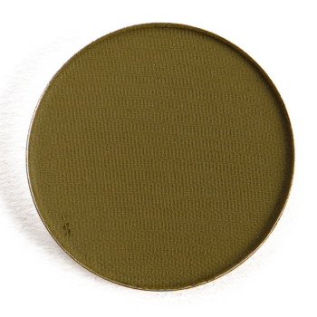


The first thing I did was pull out shades that didn’t work well with most of the shades that I’m interested in. Shades like Lemon Sorbet and Deep Desire were pulling yellower and more orange, so I didn’t think those made sense to include.
Next, I looked at all of the matte shades to see if there were any shades that were similar or overlapping to the point where both were superfluous. Haystack and Back Woods were similar with one being yellower and one being a little more olive green, and I felt like the warmth of Haystack would be more versatile as a crease color for me; plus, Wildlife and Bravo were both similar but greener, so I could layer Haystack with either.
I liked the depth of Bravo a bit more for my preferences, so I could also eliminate Wildlife. Island Paradise and Trailhead were also similar, but the quality of Island Paradise seemed better. Hot Chocolate and Caramel were comparable, and I decided to go with Hot Chocolate for the extra bit of richness it brought.
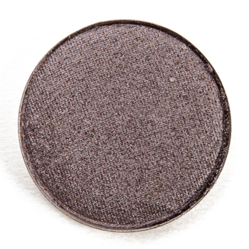
Then, I repeated the process by looking at all of the shimmer shades to remove overlapping shades. Levy, To Earth, and Timber were all darker, cooler greens, but I liked the finish and contrasting gold shimmer of Levy that I didn’t think it was as similar to the other two. As a result, To Earth seemed a bit darker and not as metallic, so I felt like it offered more contrast against Levy. I loved all of the other shimmers too much to make any moves yet… I managed to narrow it down to 21!
Step 2: Initial Refinements
Now, the “quads” I created are out of sync, so the next step was to recreate the quads of “looks” and see how that came together, which makes them look more cohesive so I can have a better sense of the direction of the color story.
Step 3: Reset
With a reset of the remaining shades into “quads,” I saw that the more taupe-like shades like Somber and Enjoy the Ride stood out, and I had to figure out if I really want to go in that direction–and I didn’t, so I was able to remove those two shades. I felt San Diego would complement the cool/warm vibes I have going on more than Peanut Butter, which was warmer, so off that one went. Take the Time and Meadow looked less and less like they belonged as they were brighter, grassy greens, and I had so many more muted, warm browns and olive greens. This brought me to 16 shades.
Step 4: Further Refinements
To get to the final 12 shades, I tried to think about how I’d use the palette and what other products I own or what other palettes I could use with it. A shade like Midnight was all well and good, but I have a lot of black eyeshadows and I rarely use full-on black eyeshadow enough for it to take up a whole spot, so away it went!
Midnight Gold and Rustic would likely serve a similar purchase for me, so I kept Rustic as it had a stronger olive undertone. Evergreen was a gorgeous color, but functionally, I’d use it in the crease with shades like To Earth, Herky Bird, and Levy–the same shades I’d use with Island Paradise. Island Paradise gave me more of the muted vibe I was going for, though, so Evergreen was eliminated.
Now, my palette ended up more shimmer-heavy, so I started looking at similar shades again: Cadet, Commission, and Herky Bird were similar enough, even though they weren’t the same. I think Cadet was more like a lighter version of Herky Bird, and I like the yellower tone that Commission brought to the party (more versatile), so that meant goodbye to Cadet!
Step 5: Reassess
The last step was to revise and reset back into quads again and make sure that it gives me the looks I want. Once I did that, I noticed that Hot Chocolate was too red and just didn’t work as easily with other shades in the palette. I still wanted a brownish tone but something warmer (but still with depth) so I ended up bringing in Tippy Taupe instead for the final 12!

Beautiful! Your palette makes me want to go sit in a forest and call the woodland creatures to me. Making up palettes is so fun. I have a 9-pan palette and exactly 9 Sydney Grace shadows in it. It’s the rose palette I always wanted lol.
I’m taking notes on this intriguing process of elimination to get a self made palette tweaked to perfection. This is something I have been putting off forever. I’ve got a bunch of MAC e/s’s in empty Elf quad palettes. There is little rhyme or reason to how most are thrown together. Have been meaning to buy a large empty palette and transfer all of them into it. Again, I always put it off, mostly out of laziness.
I have a whole bunch of Colourpop, ABH and Sydney Grace individual pans (like, at least a couple of hundred) and a stack of magnetic palettes of various sizes and every now and then I pull them all out, remove all the eyeshadows and then remix them. It usually takes all afternoon, but after doing this several times I have learned what works for me – and it’s not just picking colours that look nice together (although that works sometimes!).
I start with matte transition and depth shades and build from there. It’s easiest to start with a tonal theme and I have found it difficult to get warm and cool shades to play nicely together, so I tend to stick with neutrals and then add in pops of colour and shimmer (or, um, glitter) in a corresponding complementary colour family. I have one 24 pan palette that is filled with my absolute favourites and unsurprisingly, I use that the most, but I have also gotten into the habit of stacking whichever one I’ve used behind all the others, so it makes me rotate through them more effectively.
I also rearranged all my Viseart Petit and Edit palettes (except Paris, since I got that one most recently) – I figure I can always put them back how they were originally if I want to! I also like to include blush and highlighter shades (SG, mostly) sometimes in the larger palettes too.
As for colour choices, I tend to stick with champagne, beige, rose, mauve, brick and not too dark browns as core shades and then add in a few greens, sunset colours, purples or jewel tones so I can do a basic eye or play with colour, depending on my mood that day. I know that if I stick just brights or all smoky shades in one palette, I just won’t use it.
“Building your own eyeshadow palette is easiest when you understand your own preferences”
I had to smile, reading this, because, of course it explains why I have about 25 variations on MUFE’s original Reptile and MAC Sumptuous Olive type shades. I never seem to progress to Steps 2, 3 and so on….
Haha! This is what I do. I always justify buying the dupe bc it might be better? I know what I like.
It was really interesting to see your process. I think these are really good ideas for building one’s own palette.
Love this post! I also own all but two of your original 28 (in addition to many other singles from SG). I love pulling them out and rearranging them. It is my zen moment of the day when I stare at all of my pretties and figure out which ones I feel like combining today.
Thank you for sharing your thought process in putting together color stories.
Wow, that is impressive — 26 of the 28! 😉
I have a lot more, too. I really love their eyeshadow formulas. With my brushes and the techniques I use, they just work so beautifully for what I want them to do. I keep them in palettes from coastal scents since those have a transparent lid. I hope they have their Christmas in July sale again as I fully intend to purchase more :).
When I built my first palette (2018), all from Colour Pop, I made a table in Microsoft Word, did screen snips of colors I liked or thought would be fun, and placed them in the Word table. I moved around colors and exchanged them until I was happy with what I’d chosen and how they were laid out. I’m the queen of indecisive and a perfectionist so it was very helpful for me to have a complete palette visual to make my choices. I printed off the Word table so that when the singles showed up I knew where I wanted to place them 🙂
It is still my only palette I’ve intentionally made with singles and I really love it and use it often. I have a row of matte neutrals on top that I can use for every day and then the left two rows are yellowy oranges and peaches, in the middle are my “forest” colors that are greens and a shimmer brown, next to that is my more neutral but highly shimmery row, then my pink/purple row, and then my “mermaid” row of deep navy and seafoam green. It is a 24 pan palette (10 matte/10 metallic/4 seriously shimmery). I can use each row down as a color story, quads are laid out nicely, and I have pretty much any color combo I’d want to travel with in just one palette.
You really went there, Lauren! Happy to hear that all the effort paid off 🙂
This is how my Colourpop palette (self made) is done. It’s got everything I need and never leaves my vanity, although if I traveled at all, I’d probably either take it or buy everything again so I could keep it in my travel bag.
I have TONS of premade palettes and I love 98% of them, but sometimes I just need something that’s not in those palettes and my self-made palette always has the answer.
For me, it’s a row (4) each of: gray/silver/black tones; warm browns; cool browns; yellow/golds; orange/reds; and pink/purple. Yes, I love other colors too but these are the ones I gravitate most towards.
It has several great transitions, both a black and a dark brown, and both shimmery and matte shades otherwise. I’m not someone who uses pale shadows very often so a pale peach in the orange row is about as pale as I get. I love that we can individualize!
Yours sounds great!
Omg that’s an awesome idea
This serie of posts is so useful ! I am often stuck with so much to shoose from, so it really helps ! Thank you
I have 3 adept palettes, for CP, SG, and Viseart. One column in the SG Adept is transition shades. SG has color-leaning neutral mattes for every colorway. The rest of the SG is arranged by color and lightest to darkest, whereas the CP usually keeps the palette shades intact, but with a different layout. I usually choose 3-4 shades, add the relevant SG transition and put them in the Ofra easel-like palette. I used to have old MUFE yoghurt and 2-3 warm/cool transition shades living in the Ofra empty, but somehow it seemed limiting, esp with the variety of SG transitions. Works for me.
I am so bad at making palettes and always end up decluttering them within a year. (I am also only own like 8 singles; in just not good at putting together colors that work well together.) I made a 12-pan with SG shadows recently but it was intimidating for me so all I did was pick 4x monochromatic trios in colors that my collection was lacking. I appreciate this post.
I love these posts where you share your thinking process, like the recent ‘This or That’ series.
I have four custom-made palettes, put together in ways that seemed obvoius to me. The smallest is all warm-toned greens, arranged from light to dark. Two larger ones that house all my old shadows (not admitting their age) in random shapes and sizes, one warm-toned palette, one cool, arranged light to dark w/in each color clump. The last is my collection of newer singles – all CP , SG or ABH, lightest to darkest fm L to R in rows of 6. Turns out they’re mostly neutrals: top – neutral light shimmers. 2nd – yellowed browns, matte and shimmer, plus a coral. 3rd – pinker/cooler browns plus 2 blues. Bottom – greys & silvers, from warmest to coolest. Mostly it’s set up to find my stuff easily, and fit into the available space – but not pre-thinking quads, or the feel of a collection. Given my simple eye looks, this works well for me. TMI, amirite?!!