Behind the Scenes with Illamasqua's Human Fundamentalism Collection

Behind the Scenes with Illamasqua’s Human Fundamentalism Collection
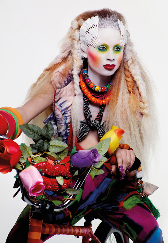
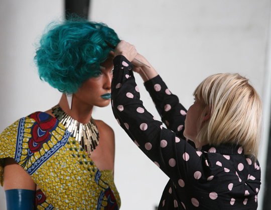
Illamasqua Human Fundamentalism is such a gorgeous campaign with really dramatic, artistic looks and costumes. I’m so pleased to be able to share several photos from behind-the-scenes that Illamasqua has provided! I’ve also included additional campaign imagery, because it’s truly stunning and inspiring!
Illamasqua also recently relaunched their website, and they’re one of the few brands that really takes the time to create real swatches shown on real people. I mean, seriously — check out their moving skin swatches! They’ve also launched an interactive Socialise aspect that includes how-tos, swatches, and more. I know that they’re going to be posting a ton of extras for their recent collection on the Socialise section!
See more photos!


can’t wait to wear APOCALIPS lipstick!
Oh my!!! Love this campaign speaks to me on so many levels…and thanks to Illamasqua for the behind the scenes shots as you so rarely get to see the human element behind the facades! Im off to check out the skin swatches now…genius idea!- Cally x
I just love the promo photos from Illamasqua…everytime they launch a collection everything is amazing, photos, products, colors and the entire presentation. 🙂 I think is way above MAC when it comes to launch a new collection, and they don’t have to launch 2-3 collections per month as MAC does. It’s just my opinion.
AMAZING! I love Alex Box.
I love it! So creative
So cool 😀
WoW!,it looks great. I wander what is the purple lip color? Could you do a tutorial replicating the look of the gold egyptian girl. I love purples.
YES PLEASE! that looks appeals to me the most!
the whole compain is really an eyecatcher <3
Very beautiful concept and the way it was carried out is very creative
Just one big piece of mindbender. Fascinating.
As a non-makeup artist, I’m really impressed with the artistry of this collection/its promos. I’ve liked some of their ads in the past, but something about this is really drawing me in more than any other ad campaign I’ve seen by other companies for a while now.
WOW. The moving skin swatch is a BRILLIANT idea! Kudos to whoever came up with that, it’s genius. I wish other beauty brands would follow suit.
The artist at Illamasqua are truly inspirational. I am floored at all these pictures, thanks for sharing! 🙂
omg sooooooo fantastic!
Oh, I always love Illamasqua’s promo pictures so much! They are one of the truly creative brands out there. But… are they painting that woman’s tongue teal? 😀
I wish there were more makeup on the male models, but otherwise, everything is so gorgeous! And the nails!
I love the white eyeliner, but at over $20 I think I will just go with Prestige’s $6 white liquid liner, especially since I wouldn’t end up using it very often. 😛
So beautiful! <3
Signs you may have gone too far: You’re styling a chicken.
You paint your model’s tongue and then you can’t even see it in any of the shots.
Can I just say how much I appreciate that the moving skin swatches re on light AND dark-skinned models!
Second that!
I like the idea of the moving swatches. It’s great that they want to give their customers a realistic view of the products. My computer’s speaker doesn’t work so I don’t know if they explain why the application is different on each model. The first model seems to get the color applied directly and intensely. The second model seems to have it modified in some way, either lip liner or lighter application. I’d like to see it applied the exact same way on both models.
I don’t think there’s any sound based on the ones I watched! The models likely have different levels of natural pigmentation in their lips – which can account for a lot of differences!
I thought about the different levels of pigmentation, but after watching so many of them I don’t think that’s all there is to it. The second model definitely has dark lip liner on in most of the lip gloss videos. Also I can see more of the color and texture of her lips than on the first model in some of the videos, which suggests that it was applied more sheerly.
Even though my skin tone is closer to that of the second model, the way the color is applied on the first model gives me a better idea of how the gloss actually looks.
I don’t think she does. I think it’s her natural lip line they’d explain if she did!
they just released some free shipping codes – “HFUK” for UK orders, and “HF45” for international orders
Damn. I can’t believe I’m about to type this, but the model with the bubblegum (7th and 8th pics) is totally selling me that blue lipstick. BLUE LIPSTICK!!
This is an amazing campaign, and I just checked their website out: WOW! The swatch pictures aren’t as clear as what we get to see here, but the fact that they’re providing them is so cool!
agree!!! so imaginative and different and pretty!!!
Oh god, the more I see of Apocalips the more I want it…
So original and daring! Very refreshing in our cookie-cutter times.
Totally editorial and not for normal people use. Can you imagine going to the bathroom with some of those nails on?
They’re not selling the nail art, so I don’t really understand the point of your comment? x.x
Speaking for myself, I would love to have those nails. That’s some serious nail action I would wear everywhere.
Is there a total break-down of the looks somewhere to be found? I’m absolutely in love with the cheeks of the “white faced biker chick”. The colors are so vibrant and bold.
They write up many get the looks on their website – illamasqua.com/socialise! x
I love the moving skin swatches! I’d love to see more companies do that!
This is really a true art form. I don’t own anything from Illamasqua…yet! Their concept is amazing and Alex Box is one of the best, for sure!
I have Fierce (the purple gloss) and I love it, and I just bought Apocalips lipstick today. It’s a crazy colour but I kind of love it and can’t wait to wear it next time I go out to a club!
Have you ordered from their site? How was it?